

Text Digitizing Techniques for Embroidery Machines
Text Digitizing Techniques for Embroidery Machines: Ensuring Crisp, High-Definition Lettering Without Letter Merge
Author Jeffry: Senior Embroidery Technician and Digitizer with 12 years of factory mass production experience proficient in computerized embroidery parameter debugging, cotton fabric embroidery troubleshooting and textile thread performance testing. All guidance is based on front-line machine operation data, AATCC industry standard tests and long-term mass production verification.
In the process of embroidery machine stitching, embroidering small letters is a common challenge for beginners and even experienced operators. Typical problems include:
- Small letters becoming illegible after stitching
- Strokes connecting to each other, turning into a messy blob
- Ragged edges and uneven outlines around the letters
- Increased thread breaks and skipped stitches at high speeds
- Drastically different results on different fabrics
These issues are not solely determined by the embroidery machine's performance, but are closely related to font selection, stitch design, density settings, stitching direction, and backing material matching. With the right embroidery text digitizing tips, even standard machines can produce crisp, clean small lettering.
1.Why Do Small Letters Cause Problems?
Limited precision of the embroidery machine
Machine precision depends on frame movement resolution (minimum step distance) and spindle speed stability. If the machine lacks precision (e.g., older mechanical models or low-end home machines), it struggles to position the frame accurately for very short stitches. This results in misplaced needle drops, overlapping or misaligned strokes, and ultimately blurry small text.
Unsuitable font choice for embroidery
Not every computer font works well for embroidery. Many common print fonts (e.g., Songti, Kaishu) have thin strokes and decorative serifs that embroidery stitches cannot follow smoothly, causing jagged edges and Letter Merge. Embroidery favors sans-serif, uniform stroke width, and rounded corners.
Poor digitizing for embroidery lettering
When digitizing for small text, failing to apply stretch compensation, proper density, correct stitching order, or manual guide lines leads to uneven stitch stacking or fabric distortion, directly ruining clarity. This is a core aspect of embroidery font design that requires careful attention.
Using the same digitized file on different fabrics
This is the most common mistake. Elastic fabrics (knits, Lycra) and non-stretch fabrics (canvas, denim) deform differently during embroidery. Using the same file on stretchy material will cause the letters to widen or shorten, inevitably leading to粘连 and distortion.
2. How to Ensure Clear Small Lettering Embroidery?
Choose an embroidery machine with adequate precision
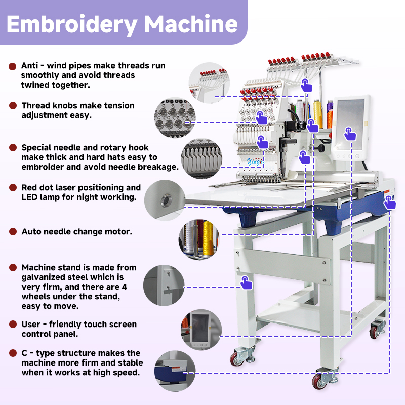
If you frequently embroider small text (height ≤10mm), choose a machine with stepper-motor-driven frame and a frame movement accuracy of at least 0.1mm/step. Commercial multi-head machines usually meet this standard; for home machines, check whether the minimum stitch length supports ≤0.5mm.
Select the right embroidery font
Prioritize fonts specifically designed for embroidery (e.g., "Sans Serif Small", "Block" in Wilcom), or manually thicken and simplify regular fonts. A good rule: stroke width ≥1.2mm, minimum gap between strokes ≥0.8mm.
Apply stretch compensation for different fabrics
In your digitizing software, set positive or negative compensation values for elastic fabrics (typically +5%~15% horizontally, –2%~–5% vertically). This allows the frame to "pre-stretch" or "pre-shrink" during stitching, offsetting the fabric's rebound deformation.
Use proper backing (interfacing/stabilizer)
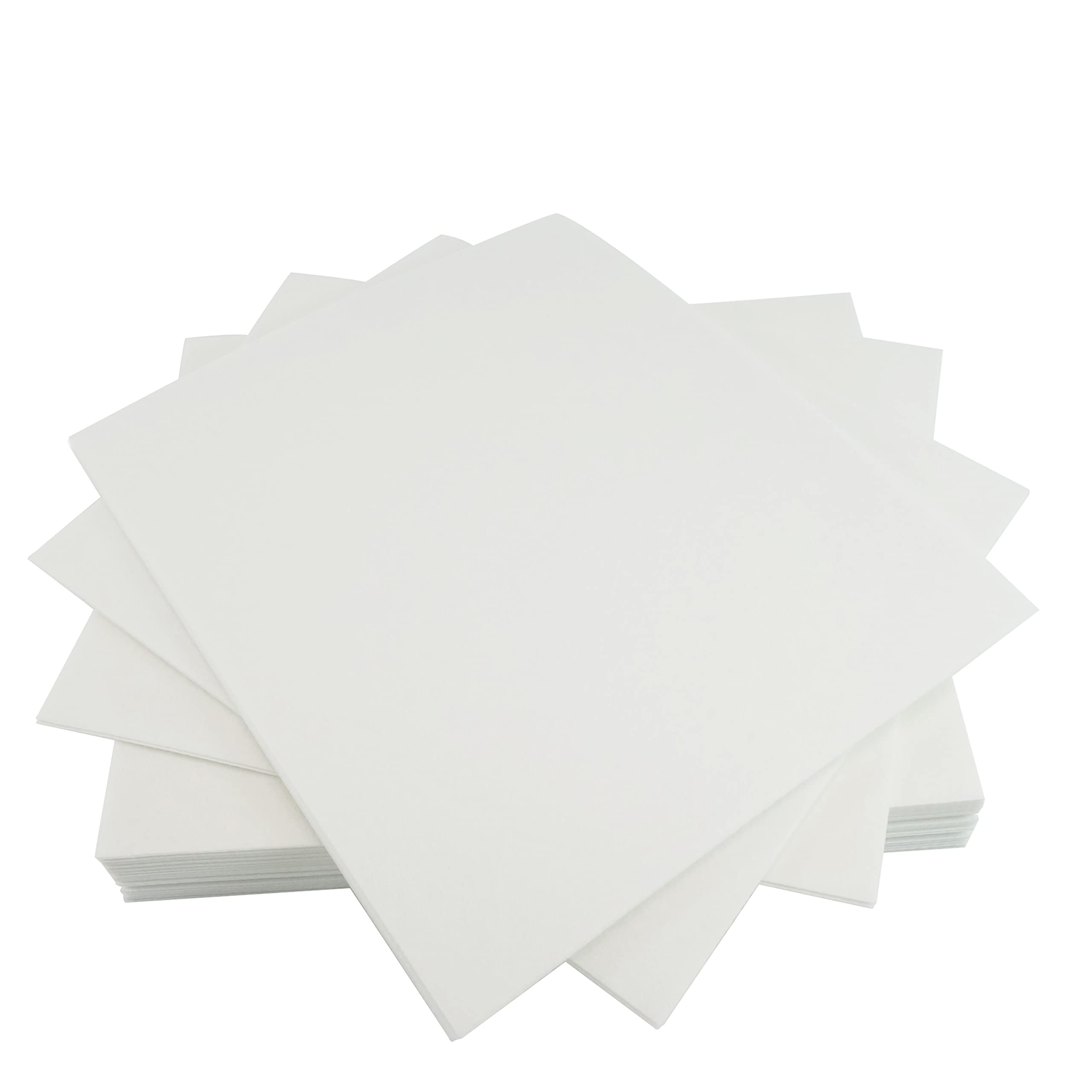
Backing is the "invisible skeleton" that prevents deformation. For non-stretch fabrics, use medium-hard water-soluble or tear-away stabilizer; for elastic fabrics, fusible or high-density non-woven stabilizer is mandatory, and double-layer backing is recommended to provide sufficient support and prevent stitches from sinking into the fabric.
3.Step-by-Step Process for Embroidering Small Letters (Practical Workflow)
Step 1: Choose a machine with suitable precision
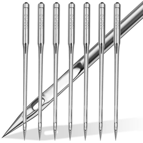
Ensure the machine supports a minimum stitch length ≤0.4mm and the frame moves without play or vibration. If possible, use a single-head or multi-head flat embroidery machine rather than a loop-type (chenille/chain stitch) machine for small text.
Step 2: Pre-plan "compensation" during digitizing
Understand stretch compensation
Stretch compensation is a digitizing parameter that predicts how the fabric will stretch or shrink during stitching. For example, for highly elastic fabrics in the horizontal direction, compress the horizontal size by 2%~8% in the design; after stitching, the fabric rebounds to the correct proportion. For stiff fabrics, little or no compensation is needed.